

Aeroflot has unveiled a new version of its website's homepage. It contains a number of improvements over the current one, but some key elements of the current homepage have been lost, according to a Travel.ru correspondent.
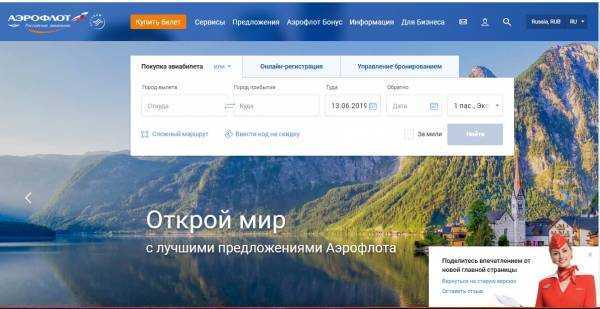
The main advantages of the new page are the online check-in and booking verification forms, which are now located on the first screen (on the current website, they are hidden in the third menu level). In the new version, they are placed on the same level as the ticket booking form and are located directly in the center of the page. This allows passengers to access most of the online services they need directly from the start page. Ideally, the online flight schedule form would also be placed there (in the proposed new version, it is located on the second screen).
Unfortunately, as on the current website, the rest of the first screen is taken up by promotional banners or videos. Most of these only reach a small percentage of passengers (or don't reach them at all, such as the currently rotating banner about the annual shareholders' meeting).
For most passengers, all this space on the first screen is simply wasted. It could be used to publish, for example, current airline news, warnings about special situations at individual airports, malfunctions, and so on, as well as to include direct links to the most important information sections for passengers (e.g., about baggage, check-in methods, airport information, ticket refunds and exchanges, and so on). It's not entirely clear whether the new design allows for the inclusion of emergency messages on the first screen, if needed.
Other shortcomings of the current version of the new design include the disappearance of the main menu subsections when hovering the mouse over the root section names ("Services," "Information," "Aeroflot Bonus," and so on). This prevents passengers from immediately finding the desired subsection and accessing it with a single click.
At the same time, the list of individual special fares (which had disappeared several years ago), company news, and additional service offers have been restored to the front page. However, all of this is located not on the first page, but rather on the third to fifth screen of the front page, and will be seen by a minority of passengers.
Aeroflot's mobile website has also received a similar new version of its home page. Passengers wishing to express their comments and suggestions regarding the new design can do so using the special form, a link to which is located in the right corner of the new home page (you can access the new version with one click from the current Aeroflot home page).
Source: travel.ru