

Moscow's Sheremetyevo Airport launched a new website in early June. Unfortunately, it's currently frankly crude, inferior to its predecessor in almost every way, and leaves airport passengers without a number of previously available features and services, according to a source.Corr. Travel.ru.
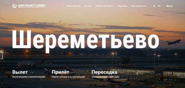
The website's flaws are clearly visible right on the start page, where the Russian version displays a list of news items with English dates. However, this is far from the main page's biggest problem. Instead of the previous start page, filled with useful information and direct links to services, the first screen now suddenly features a video about the airport. While it might be interesting to watch once for a newcomer, it will only irritate regular Sheremetyevo passengers who come to the site for flight information, not promotional videos.
Flight information—a key feature for the vast majority of visitors—is now much more difficult and inconvenient to obtain. On the one hand, the airport attempted to implement the user-friendly flight listing recently featured on the terminal boards (with codeshare flights grouped together on a single line). However, this approach has been completely unsuccessful on the website—due to the enormous and unnecessary spaces between lines, this single line now takes up far more screen space than the several lines with all the codeshare numbers on the old website. As a result, instead of the previous several dozen flights, a single screen now fits at most half a dozen, making it much more difficult to find your flight.
It's unclear why the departure and arrival times on the flight board are listed based on actual times (while the scheduled times are listed next to them in tiny print, crossed out). However, passengers are obviously searching for flights based on scheduled times, not actual times, which they can't possibly know. As a result, this column is a kind of theater of the absurd and only confuses passengers.
There are also questions about flight details. If you click on a departing flight, you'll see something like "Flight operated by Aeroflot, Air France, Alitalia, Air Serbia, KLM"—followed by links to online check-in for each of these carriers, although in the vast majority of cases, this will only be available on the website of the airline whose aircraft is operating the flight, and not on the websites of codeshare partners.
It's unclear why the website also recommends arriving 2.5 hours before domestic flights and 3.5 hours before international departures, even though check-in for many of them is still closed at that time. For example, for a Finnair flight to Helsinki departing at 5:15, the website suggests arriving at the airport at 1:45, even though a line below states check-in won't open until 3:15. For the same flight, the website suddenly states that the travel time is an hour, even though the actual flight is at least one and a half times longer.
The information in the "Departures" section borders on misinformation. "Online check-in opens 24 hours before departure. Airport check-in opens two hours before departure," the website states, clearly unaware that these times vary greatly between carriers.
The very convenient "seasonal schedule" section from the old website was completely missing from the new one. Other sections also have issues—for example, information about public transportation to the airport is minimal and far less detailed than on the old website.
There are likely many other errors and inconsistencies on the website. But these alone are enough to declare its launch a mistake. It seems the website developers made a mistake typical of these times: chasing cheap visual effects like videos, they lost sight of the interests of passengers and other website visitors. The best thing the airport can do in this situation is to immediately restore the old website and completely abandon the failed new one.
Source: travel.ru